Friday, December 11, 2015

Study Review

Study Review


New York City Marathon
 1. Today in New York, Martin Lel of Kenya is running in  the men's division for the New York City Marathon, he is racing to support his country states Martin. On November 4, 2015 in New York, Martin Lel of Kenya raced in the New York City Marathon  and won first place. 

2.  Rules of Thirds- The Rule of Thirds is when a object or person is in one of the corners of a photograph and has room to move. 

Balancing Elements- Balancing a photograph is when the elements in a photograph end up making the photograph look balanced. 

Leading lines- a line of movement going across the photograph.

Symmetry/Patterns- repeating object or a pattern in the photograph. 

Viewpoint- Level of view your photograph is at.

Background- back of photograph, usually simple

Create Depth- create depth to show off more of the photograph 

Framing- natural framing of placement not actually frame

Cropping- simple background, eye-catching object takes up most of photograph

Mergers- bad photo, someone's body part is cut out of photograph

3.  Aperture- the amount of focus in a background. low #=more focus  high #=less focus

Shutter Speed- how fast the shutter closes. high shutter=catches photograph right away
low shutter=more blur and doesn't catch photograph right away

ISO- lighting. low ISO-use in dim/dark places
high ISO- use in lit/bright places

4.  It is acceptable to photoshop if you only edit the levels or cropping. It is unacceptable if you make the photograph unrecognizable. 

5.  Environmental-  the subject in their own environment
Self- Formal: simple, plain background, person is in nice clothing 
Informal: not plain background, casual clothing
Casual-  Subject in a casual environment, quiet background

6. Exposure- amount of light per unit area.

Depth of Field-the distance between the nearest and farthest objects in a scene that appear acceptably sharp in an image.

Focal Length-The focal length of the lens is the distance between the lens and the image sensor when the subject is in focus.

7.  Early Magazine- contain a title and table of contents on front cover,  made to look like reading books

Poster Magazine- cover was mainly about the illustration on the cover, the illustration would convey a common mood or show illustration of seasons.

Married to Type- cover illustration related directly to title or cover lines, contained logos

Forest of Words- covers contained title, cover lines, and photograph, covers showed news, reality show content, fashion, music, and top trends. Subject in photograph was "surrounded by bushes" of cover lines .


Monday, December 7, 2015

Fashion Photography

Fashion Photography 


Video #1-

1. Changes to model's face:
  • makeup added to cover blemishes
  • nose thinned 
  • lips made plumper
  • face thinned 
  • neck made longer
  • cheekbones made more noticeable
  • eyes lowered 
  • neck made thinner
  • eyes enlarged


Video #2-

2. Changes to model's body:

  • get rid of blemishes
  • plump lips
  • widen nostrils
  • enlarge eyes
  • slimmed nose
  • change eye structure and eyebrows
  • slimmed face
  • highlighted face and body
  • stomach was slimmed
  • legs lengthen
  • butt slimmed  
  • boobs made smaller
  • feet slimmed
  • legs made curvier
  • neck made slimmer+longer

Video #3-

3. Changes to model:
  • slimmed legs
  • slimmed arms
  • toned butt
  • rounded butt
  • made stomach smaller
  • made boobs bigger
  • made back slimmer/smaller
  • made arms thinner
  • made legs smaller, curvy 
  • made waist smaller and boobs more round
  • lifted butt
  • thinned entire body
  • added longer hair
  • made face thinner/smaller
  • thinned hand
  • entire face was thinned


4. No, because I believe if you wish to take a photograph of someone you should keep the person as they are and not change them. I think that photoshopping a person's body or face is unacceptable and should not be done.

5.  I think something more ethnically wrong to do in photo manipulation would to change the entire body until they make the person unreconizable or if they change the skin tone could be very wrong. 

6. something more acceptable would to leveling or cropping a photograph, and not changing the person in the photograph or background. 

7. Fashion photograph changes the person in the photograph to be "more acceptable" to society or to be "society standards" whereas photojournalism is to show an event and when it comes to photoshop photojournalism levels and crops photographs only to show a event.

8. Fashion Photography changes their photograph to make it "more acceptable" to the viewer and to make the model in the photograph show "society standards". Fashion photography makes you believe the model is naturally beautiful and makes you think you have to be like the model.
Photojournalism shows an occurring event or to tell a story.

9. To show us the horrors of bad photo manipulation and that it should not be done because it is not a good thing to do. 

10. Because society always pressures women about being perfect and that they have to fit a "certain standard" to be beautiful, also because mainly women's photographs are photoshopped and manipulated. 

Thursday, December 3, 2015

Blog #4-Magazines Part 2

Blog #4- Magazines Part 2

1. Early Magazine Covers-


Early Magazine Covers are not like covers from present day instead covers would contain a title and a table of contents. Early Magazine Covers were made to look reading books and lasted from the 1700s through the 1800s. Some Early Magazine Covers towards the end of the 1700s contained photographs or drawings that related to the title.


examples of covers: 


2. The Poster Cover


The Poster Cover started in the 1800s and lasted till the 1900s, the cover was now mainly about the drawing/illustration. On some Poster Covers the drawing/illustration sometimes didn't even relate to the title.  The Poster Cover's illustration would convey a general mood or show a illustration of a season. In the 1920s through 1960s, poster covers were very popular and were on most magazine covers.

examples of covers:


3. Pictures Married to Type

Pictures Married to Type contained a photograph or illustration and started in the late 1800s/early 1900s. Pictures Married to Type had to do with the title and contain symbolic pictures/photographs, they represented the title displayed on the cover. This time period as started to put logos on their covers to show belonging to the magazine and to get more publicity. This time period also slowly started to put cover lines on the covers to show more content of the magazine. 

examples of covers:


4. In the Forest of Words


In 1937, the "In the Forest of Words" type of cover was created and ended in 2001. These covers were more artistic and had a title, cover lines, and a photograph as the cover. The covers of this time period also mainly contained portraits of people in formal or informal ways. These covers showed news, reality show content, fashion, music, and top trends. These type of cover was called "In the Forest of Words because the portrait of the person usually was surround by "bushes" of cover lines. 

examples of covers: 


Blog #3- My Favorite Cover

Blog #3- My Favorite Cover

favorite
Vanity Fair, November 2014, Jennifer Lawrence
"Just before her intimate photos were hacked--and splashed across the Web--Jennifer Lawrence posed topless for Patrick Demarchelier for the cover of Vanity Fair's November issue. As part of the accompanying cover story, she decided to break her silence about one of the biggest scandals in Hollywood this year. The Guardian called her salvo "the end of the 'shamed starlet.'" So strong was the outpouring of social-media support for Lawrence's stance that The New York Times reported on the fact "fans took to Twitter to applaud her." Demarchelier's striking photos of the Hunger Games actress also helped spark a thoughtful debate about a woman's right to reveal her body. Lawrence (and the V.F. cover) made her message loud and clear: "It's my body, and it should be my choice."


Critique

I like this cover a lot, it shows the beauty of Jennifer Lawrence and Jennifer says "It's my body, and it should be my choice." I like that she said that because it relates to society's image of women and men and how they have to change themselves to fit in, instead Jennifer says since its her body that she has a choice on how it should be, which I believe every girl or boy should think. I think the photograph was really good, the lighting was really good and so was the balance of the photograph. I  overall really liked this photograph.


Blog #2- Best covers


Blog #2- Best covers

News, Politics, and Business 


1. The Advocate, December 2014/January 2015, Person of the Year PORTRAIT/FORMAL
2.Wired, September 2014, Edward Snowden PORTRAIT/INFORMAL
3. ESPN The Magazine, October 13, 2014, Derek Jeter PORTRAIT/INFORMAL
4. The New Yorker, September 8, 2014, Derek Jeter Bows Out PORTRAIT/INFORMAL
5. OUT, August 2014, Michael Sam PORTRAIT/FORMAL
6. Harper's Bazaar, March 2014, Lady Gaga PORTRAIT/INFORMAL
7. ESPN The Magazine, July 21, 2014, Venus Williams PORTRAIT/INFORMAL
8. New York, February 17–24, Spring Fashion PORTRAIT/INFORMAL
9. The Atlantic, November 2014, Why Kids Sext PORTRAIT/INFORMAL
10. Bloomberg Businessweek, April 7-13, 2014, The Man Who Saved Marvel PORTRAIT/INFORMAL
11. New York, November 17-23, 2014, Speaking Emoji NOT PORTRAIT
12.FamilyFun, August 2014, Road Trip PORTRAIT/INFORMAL
13.Real Simple, March 2014, 26 Best Beauty Products of All Time NOT PORTRAIT
14.Real Simple, December 2014, Holiday Spectacular NOT PORTRAIT
15.The New York Times Magazine, September 14, 2014, The Culture Issue PORTRAIT/INFORMAL
16.Harper's Bazaar, September 2014, Emma Ferrer PORTRAIT/FORMAL
17.Vanity Fair, November 2014, Jennifer Lawrence PORTRAIT/FORMAL
18.Variety, October 14, 2014, Bill Murray PORTRAIT/FORMAL
19The New Yorker, December 8, 2014, Broken Arch NOT PORTRAIT

Tuesday, December 1, 2015

Blog #1- Magazine tips

Blog #1- Magazine tips 


1.  eye-catching cover 
2. cover lines 
3. logo 
4. coverlines
5. mood cover creates 

Prompt Shoot (purple,cold,electric)

Prompt Shoot (cold, purple, electric)


Purple-


Electric-


Cold- 


Monday, November 16, 2015

American Soldier

American Soldier

A. The photograph with the most impacting emotion on the viewers in the photograph with the three men huddled together hugging each other in the bedroom. I think so because it is saddening and shows emotion in the photograph. 

B. Set #1: at home- Image #1-Image #3
   Set #2: joining army- Image #4-Image #5
   Set #3: training- Image #6-Image #12
   Set #4: preparing for war- Image #13-Image #16
   Set #5: war- Image #17
   Set #6: moving locations- Image #18-Image #19
   Set #7: war: Image #20- Image #26
   Set #8: returning home- Image #27-Image #28 

C. Set #7 because, they were in war and they looked very afraid and also tired. I think this set was very powerful because the photos showed their pain and emotion to being in war, they all looked very tired and wanting to leave. 

D. It shows one character's story, it shows them before and then joining the army, it shows his experience and fear. It shows that he gets back and how happy he is to be home. 

E. They wrote in past tense as if he might not be there to tell the story. 

F. The captions enhance the photographs by making the viewer feel worse and understand his emotions more. 

G. Joining war was hard, so was fitting in. He joined the war and then wanted to leave, he tried and worked hard to be a soldier and eventually was but before that he had to work hard. Ian worked hard and eventually started feeling like a soldier and felt like he fit in. While he was away he broke up with his girlfriend and was saddened about that because he was going to propose. Ian was depressed about that and having to go to war soon after. Ian went to  war and survived. He then was deployed to another area and traveled there. Ian had to fight a more dangerous war and he ended up surviving, he went home on August 14, 2009. After the long training and war, he was happy to be home. 


Thursday, November 12, 2015

Self Portraits and Portraits Part 1

Love and Loss warmup


1. Looking through these photographs I experienced happiness, sadness, and pain. Happiness to see the love of two people, Sadness for what cancer had done to the lady and Pain for the loss of a life and pain for the loss of hope she must of experienced.

2.I think the photographer meant that the photographer is showing a story and so he was saying that "These photographs do not define us, but they are us." because the photographs show themselves and their story.

3.Yes, I believe I would take the photographs to show the person's story, to show they tried and hadn't given up. I would take the photographs to show the loss of a loved one, to show their story from happiness to pain.


4.I would tell him she didn't deserve this but yet he'd know, I would tell him he showed a unique form of pain through his photography. That his work was saddening yet strangely beautiful. 


Self Portrait and Portrait Part 1

4. Experiment with Lighting

Another element of randomness that you can introduce to your portraits is the way that you light them. There are almost unlimited possibilities when it comes to using light in portraits.
Side-lighting can create mood, backlighting and silhouetting your subject to hide their features can be powerful.

7. Introduce a Prop

Add a prop of some kind into your shots and you create another point of interest that can enhance your shot.
Yes you might run the risk of taking too much focus away from your main subject but you could also really add a sense of story and place to the image that takes it in a new direction and gives the person you’re photographing an extra layer of depth that they wouldn’t have had without the prop.

18. Experiment with Subject Expressions

In some portraits it is the expression on the face of your subject that makes the image.
Get your subject to experiment with different moods and emotions in your image. Play with extreme emotions.

Environmental Portrait
1.

I chose this photograph because it shows the environment the man is in and how he responded to it. I like this photograph because the man is playing a violin and its a nice picture. 


2. 


I chose this photograph because it shows his environment and what he does because of it. I like this photograph because the man is blowing a big horn (which is cool) and has a cute dog.


Photography Self Portrait
1. 
I chose this photograph because it really shows how the photographer feels and their emotions. I like this photograph because it is very deep and is a nice photograph. 

2. 
I chose this photograph because it is showing the "society standards" and how the lady has to hide herself or put a mask on to society. I like this photograph because she is showing that is very true and it is saddening that society is like this.

Casual Portrait

1. 
 I chose this photograph because it looks more casual then the photographs self portraits and because it shows the person/people as they are. I like this photograph because the people look generally very happy. 

2. 
I chose this photograph because it looks like a casual, happy photograph. I like this photograph because the lady in the photograph looks really happy, and seeing happy people makes me happy. 


I will take photographs of my best friend, Jessica, I will shoot outdoors in a green forest area (near Jessica's house, in Shady Hollow). I will change the lighting of the photographs to make my work successful. I will have my photograph show emotion and a mood so the viewer understands the vibe of the photographs. 


Tuesday, November 3, 2015

Rules of Photography Part 2

Rules of Photography Part 2


1.Rule of thirds:


2.Balancing Elements:


3.Leading Lines:


4.Symmetry and Patterns (repetition):


5.Viewpoint:


6.Background:


7.Create depth:


8.Framing:


9.Cropping:


10.Mergers and avoiding them:

Wednesday, October 28, 2015

Africa and Abandoned Theme Parks

Africa

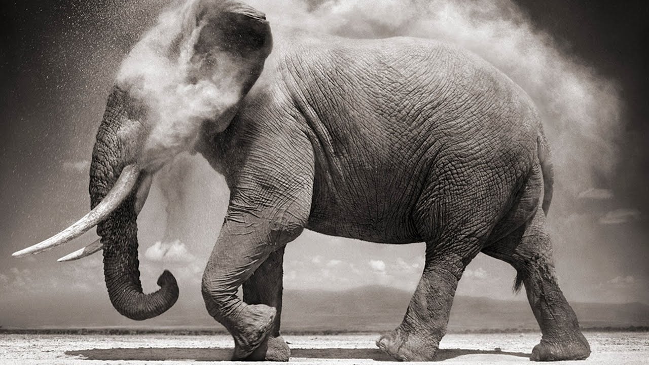
1. My reaction to Nick Brandt's trip is I am amazed that he had survived and that he had not died. I learned he has some experience with wild, big animals,(elephants, buffalo, and baboons), and so he knows how the wild animals think in a way. I really like the elephant photograph from the slideshow. I like that it has balance and how by the looks of the elephant it kind of tells the elephant's story.  

2. 
3. I like this photograph because it has an elephant and that's one of my favorite animals. I also like this because it isn't a normal photograph of an elephant, it shows action in it. 

4. I think the rule of photography that was used in this is balance. The photograph looks balanced by the trunk and tusks and then the dust on the right side.

5. He uses a Pentax 67II with only two fixed lenses. This is important because the Pentax 6×7 has its own dual bayonet lens mount, and a wide range of interchangeable Takumar lenses, this makes it easier for when Brandt's taking photographs of wild animals because he doesn't have to be to close to an animal to take the photograph in which using the Takumar lenses it makes his job safer for him.

6. Nick Brandt takes the photographs he takes to show support and hope that these beautiful animals don't become extinct and that it is very sad that the animals are being hunted for their fur, tusks, hides, etc. Brandt wants to show the living beauty of the animal and also the animal in its natural habitat and not in a zoo or circus. 

7. Brandt hopes people will stand up and support the animals that are being hunted. He wants people to see their living beauty and not the "beauty" of being on someone's floor or wall.

8. "But instead of a herd of elephants striding across the grassy plains of Africa, here we see only their remains: the tusks of 22 elephants killed at the hands of man within the Amboseli/Tsavo Ecosystem."

Photo with quote


Abandoned Theme Parks

1. "Takakanonuma Greenland" in Hobara, Japan
I liked to go to this park because it just looks like it is a haunted theme park. It looks like it has beautiful scenery around it and so I'd like to take photographs of that and the abandoned rides. I would also like to bring friends and take photographs with them.

2.
3. 
  • haunted house
  • abandoned farm
  • abandoned neighborhood
  • church
  • abandoned factory
4.

I would like to take photographs here because I could take photographs of the abandoned farms and the wild life around it. I would like to adventure around the area and see new angles to take my photographs. I would also like to take photographs at this abandoned farm because of the beautiful scenery around it. 

5. If I went to this abandoned farm I would take a tripod and a few different lenses to get a photograph up close and one showing more the landscape. I would pack light and carry a backpack with food, camera bag with lenses in it, water, and extra warm clothes. I would also first check out if I need to sign any papers to take photographs or go on the land.


Monday, October 26, 2015

Funny Captions

Funny Captions
10/25/15 

"Hear no evil, speak no evil, see no evil, and flip it off every time it tries to consume you."
"I'm blind though, Janice." 
"Step one done." 

"This will be fun they said, 30 minutes later my glasses are missing and I have lost my crutch. I cannot see without my glasses so it may take a while to find my crutch, I hope someone finds it."


"I am not having a very good day and keep seeing people staring and laughing at me. I am very confused and would like to know what's so funny?"